In 2022, I moved to Dublin to study Interaction Design. A city I have never been to before and didn't know anything about at all, really. So as simple as it sounds, I just started walking around and at some point after getting kind of lost, I stumbled into this small pub and had the best (and first) Irish breakfast I ever had. And an idea.
I wanted to build something that gives people this feeling on purpose. There are so many apps that tell you where to go or what the coolest brunch-spots are right now, but I wanted to create one that makes you want to find out for yourself. What does 'cool' even mean to you, personally? An app that turns any new city into an actual adventure and switches the hour-long Google Maps scrollings with genuine and long lasting memories.
This became my MA thesis project at NCAD Dublin.

Technically a city I know, but I hadn't been to Hamburg in a while and I was looking at it through a completely different lens this time. My immediate instinct: open Google Maps, find breakfast. Google's yellow cluster markers give you a decent overview of where to find what, but I caught myself scrolling through options for way too long before I'd even left the apartment. That's exactly the opposite of what I want to happen.
How might we…
get people to stop scrolling and start exploring outside?
After finally deciding on a place, I spent most of the day walking around. At some point I wanted to find some nice spots for photos, maybe a park or a quiet street with interesting architecture. But every navigation app just wants to get you from A to B as fast as possible. I ended up on a main road next to traffic when there was probably a beautiful side street two blocks over. Nobody's really optimising for "the more scenic route."
How might we…
recommend more interesting routes over faster ones?
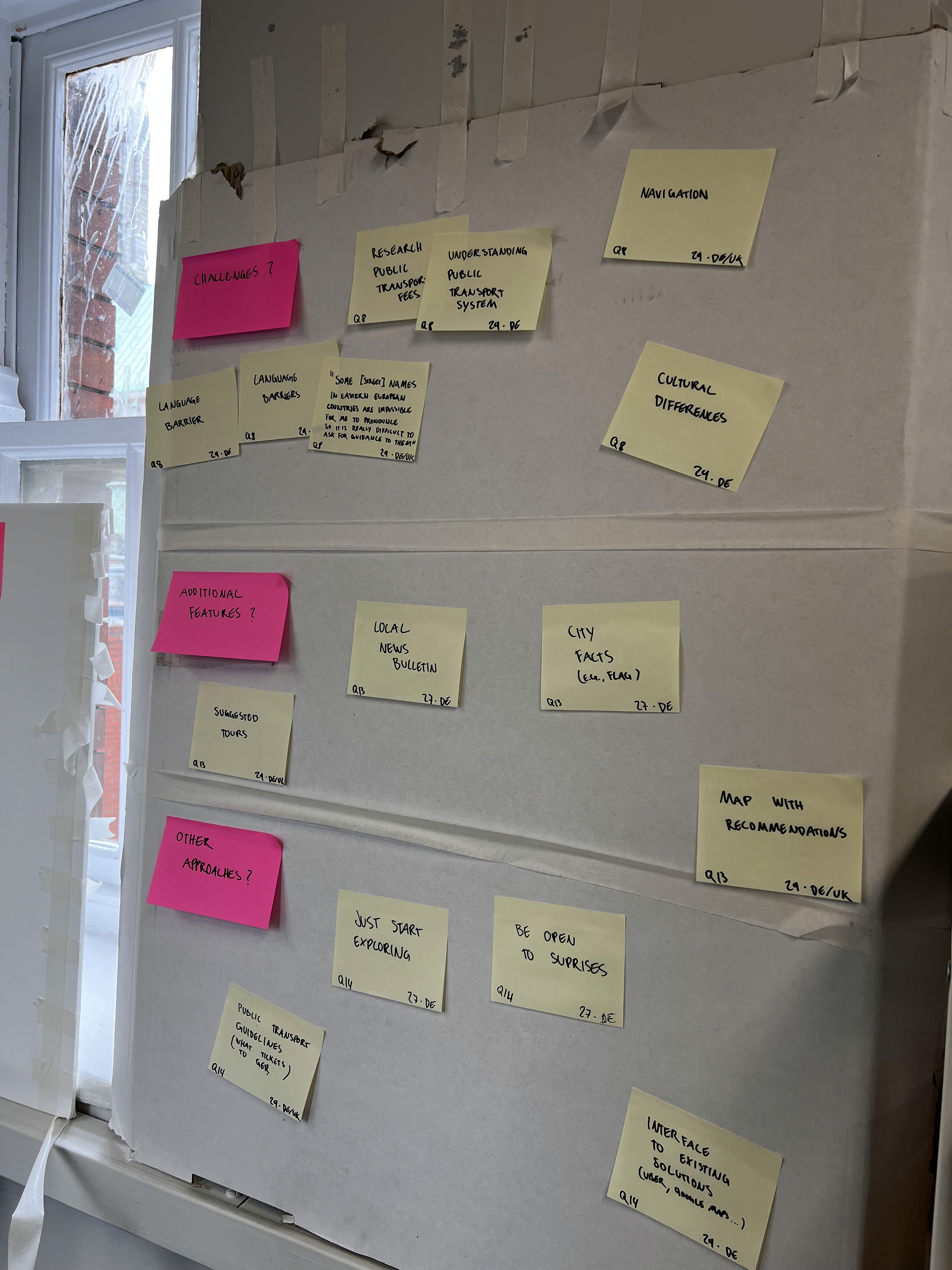
Getting around Hamburg I used the local HVV public transportation app, which was actually quite nice. It recommended connections, sold the tickets in-app, and was easy to use. But it immediately made me wonder: this works here, what about everywhere else? Every city has its own transport app with its own quirks. If I'm designing something that's supposed to work across cities, how do I deal with that?
How might we…
account for transportation and routing across different cities?

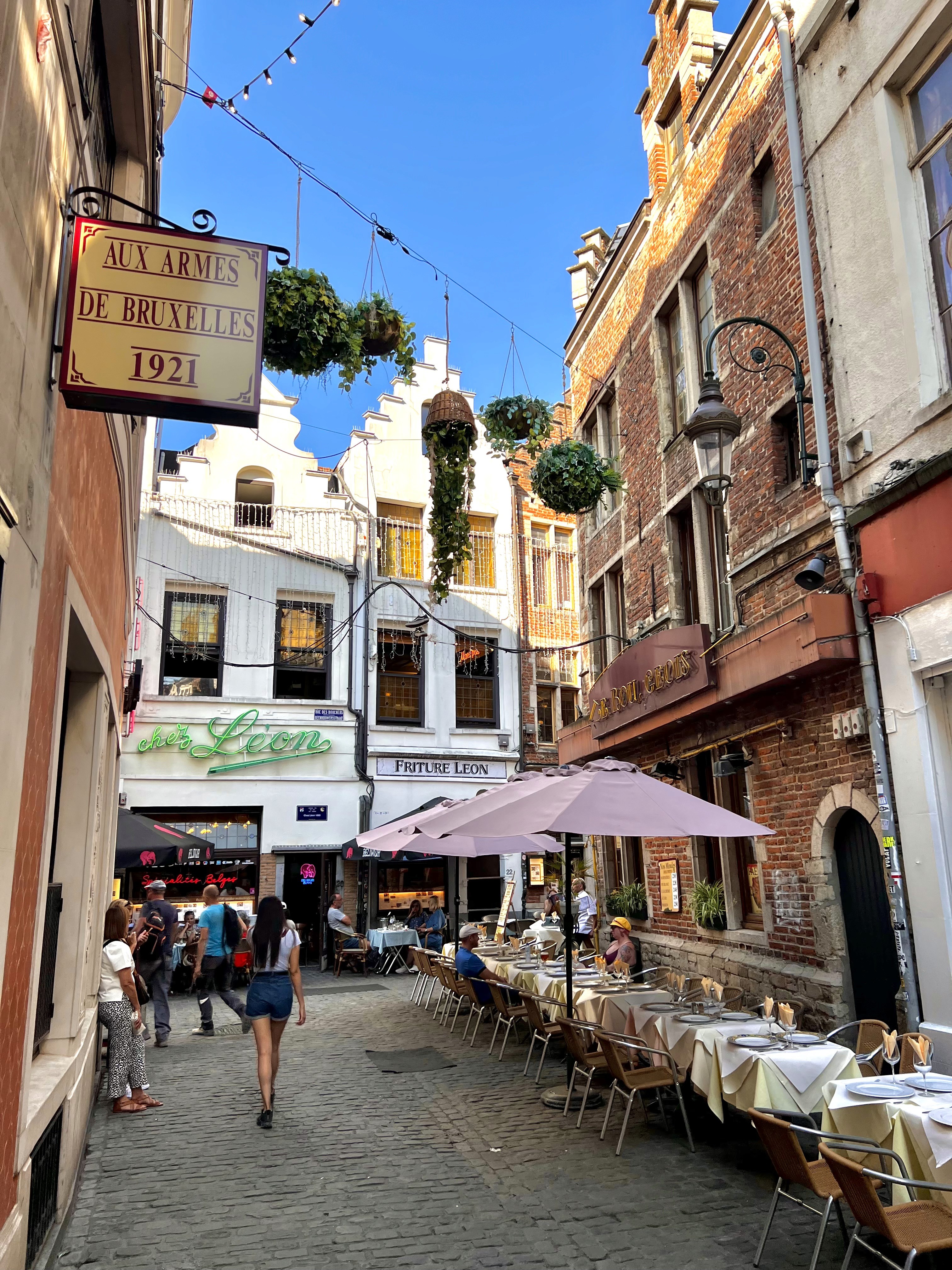
My very first time in Brussels. I arrived in the evening and (first things first) went out to grab a beer at a nearby bar. I had some nice chats with locals, which was great, but it would have been nice to also connect with other travellers. People in the same situation as me, exploring a city they don't know yet.
How might we…
help travellers meet and connect with each other?
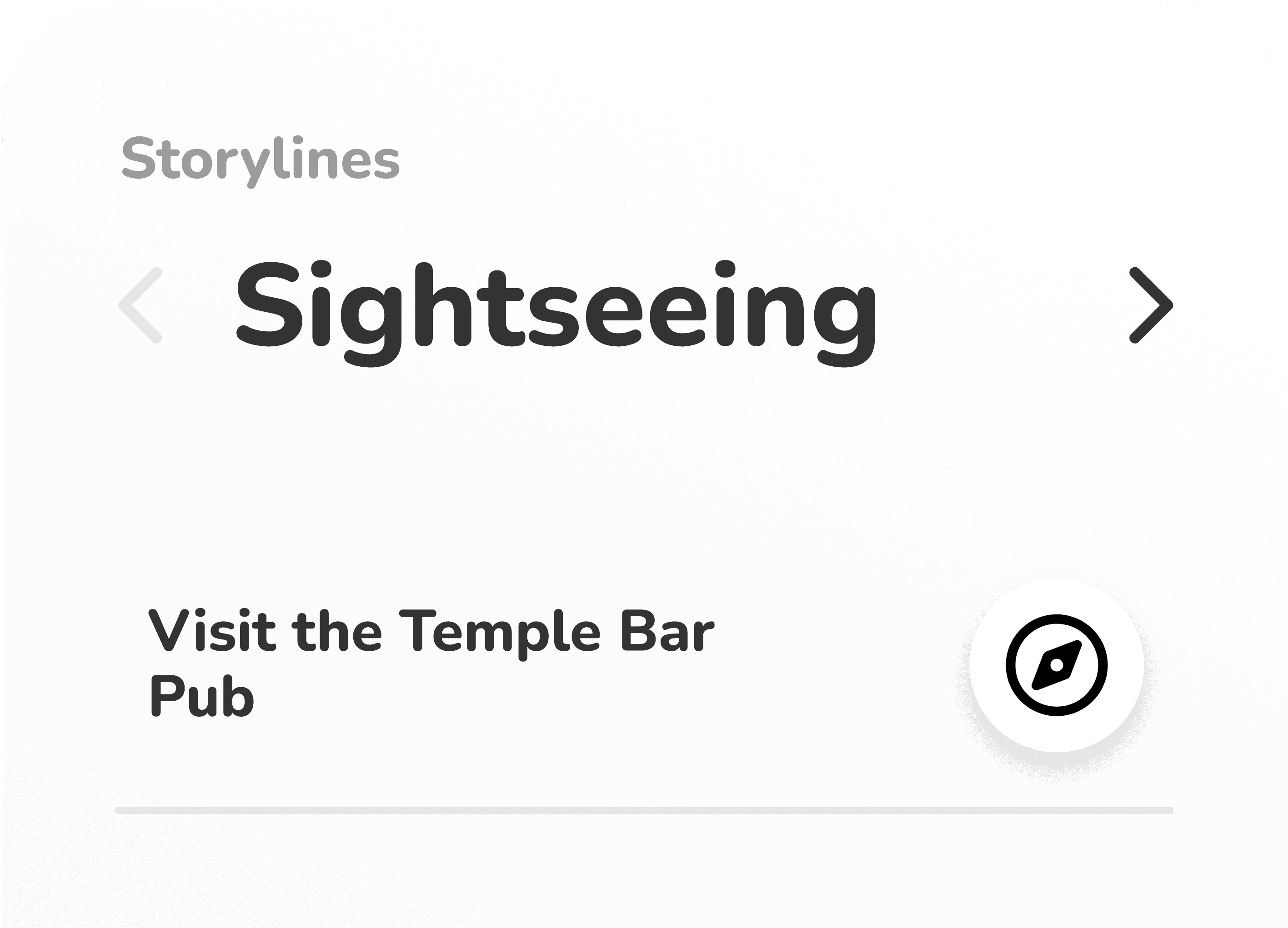
The next day, I decided to try something different and use AI to plan the whole day. Could something like ChatGPT handle the messy, personal nature of exploring a city? I started by having it ask me 20 questions about my preferences, what I like, what I avoid, how I usually spend time in new places. Then I let it build an itinerary from that. It went fine. It knew what I said I liked, but the recommendations still felt generic. Some places were outdated, some had wrong opening hours, and the whole plan fell apart the moment I didn't feel like following it anymore. The real problem wasn't that it didn't know my preferences. It's that city trips are inherently unplanned. You walk past something that looks interesting and you want to go there instead. A fixed itinerary, no matter how personalised, fights against that.
How might we…
suggest different plans for different interests, with optional rather than fixed recommendations?
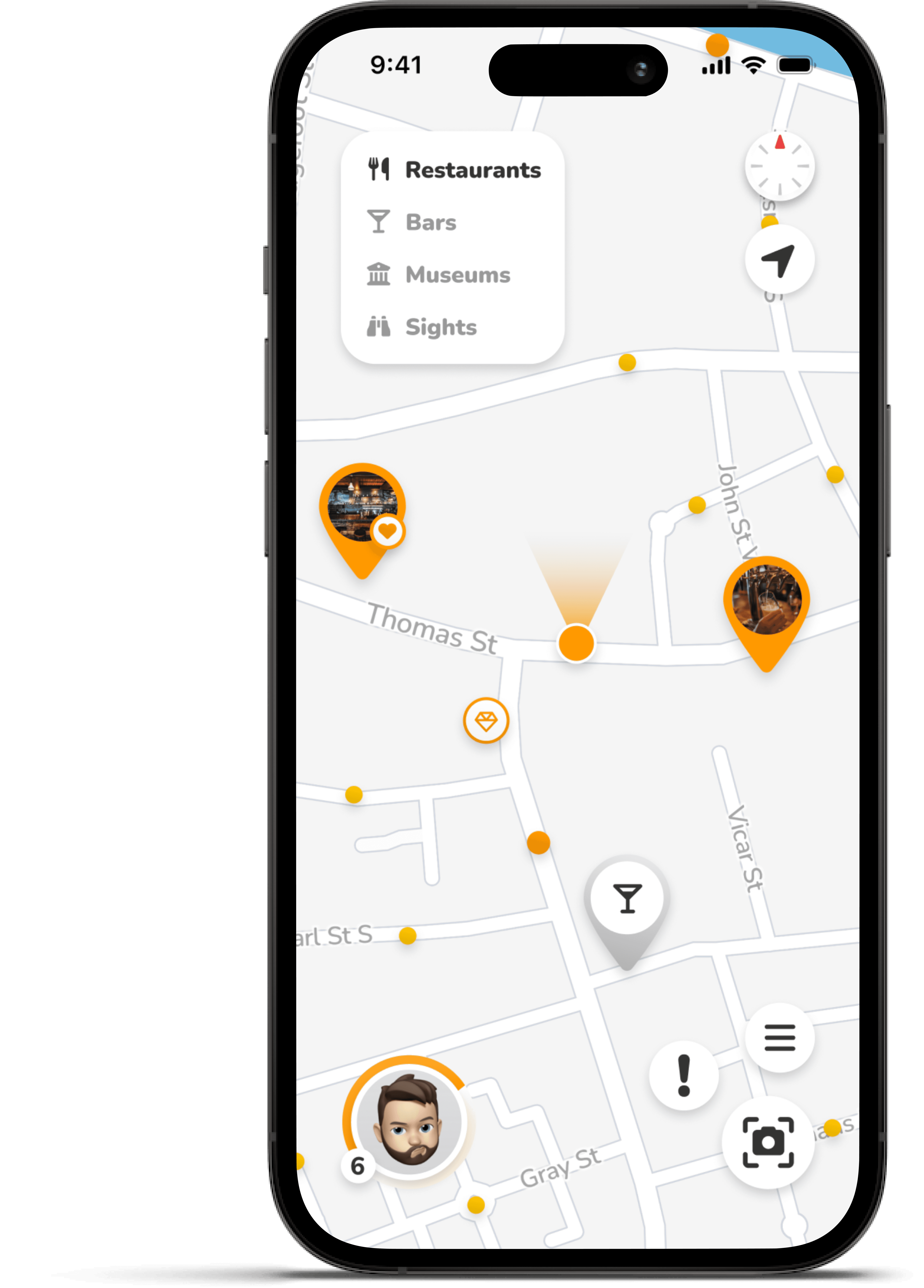
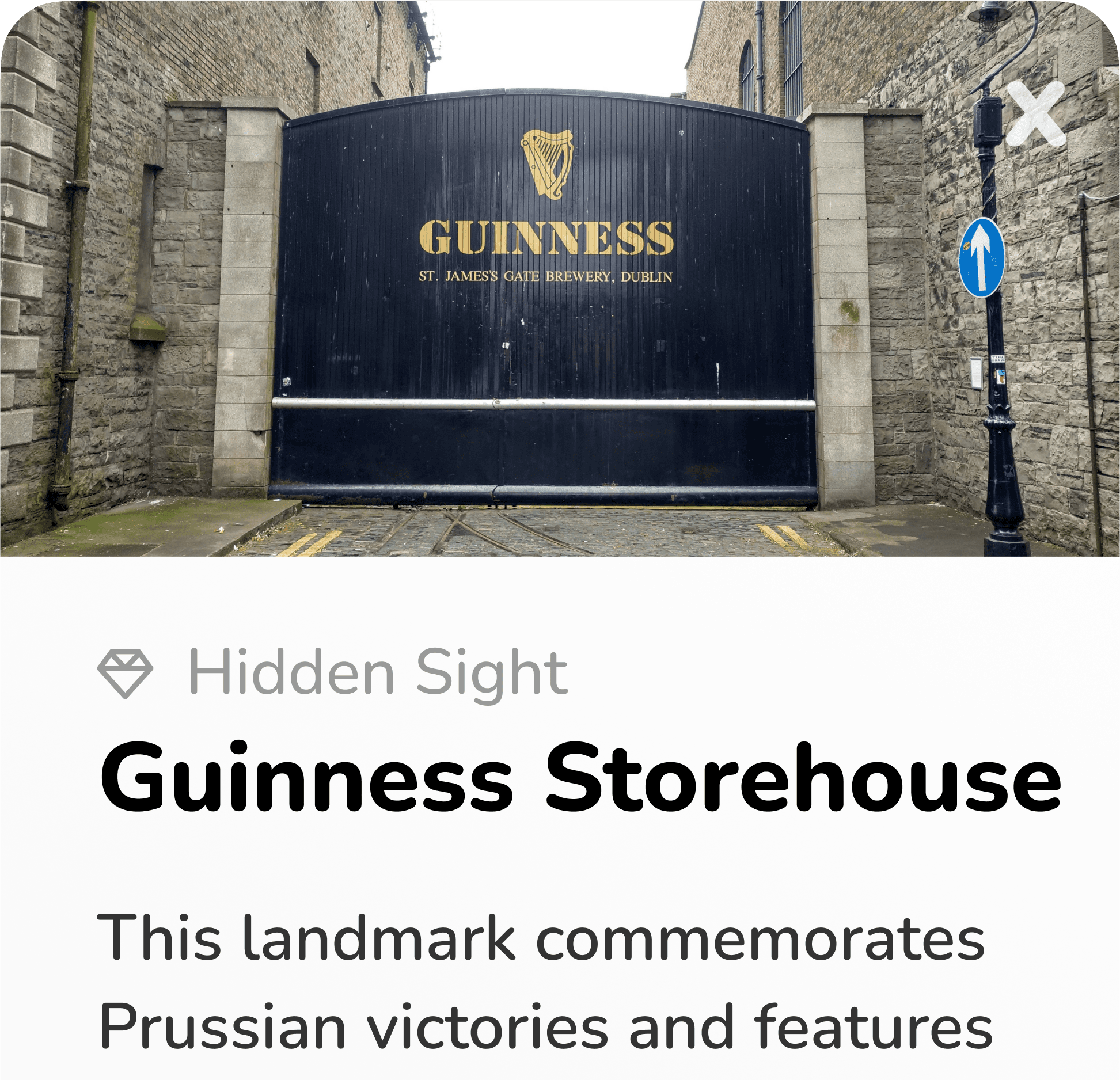
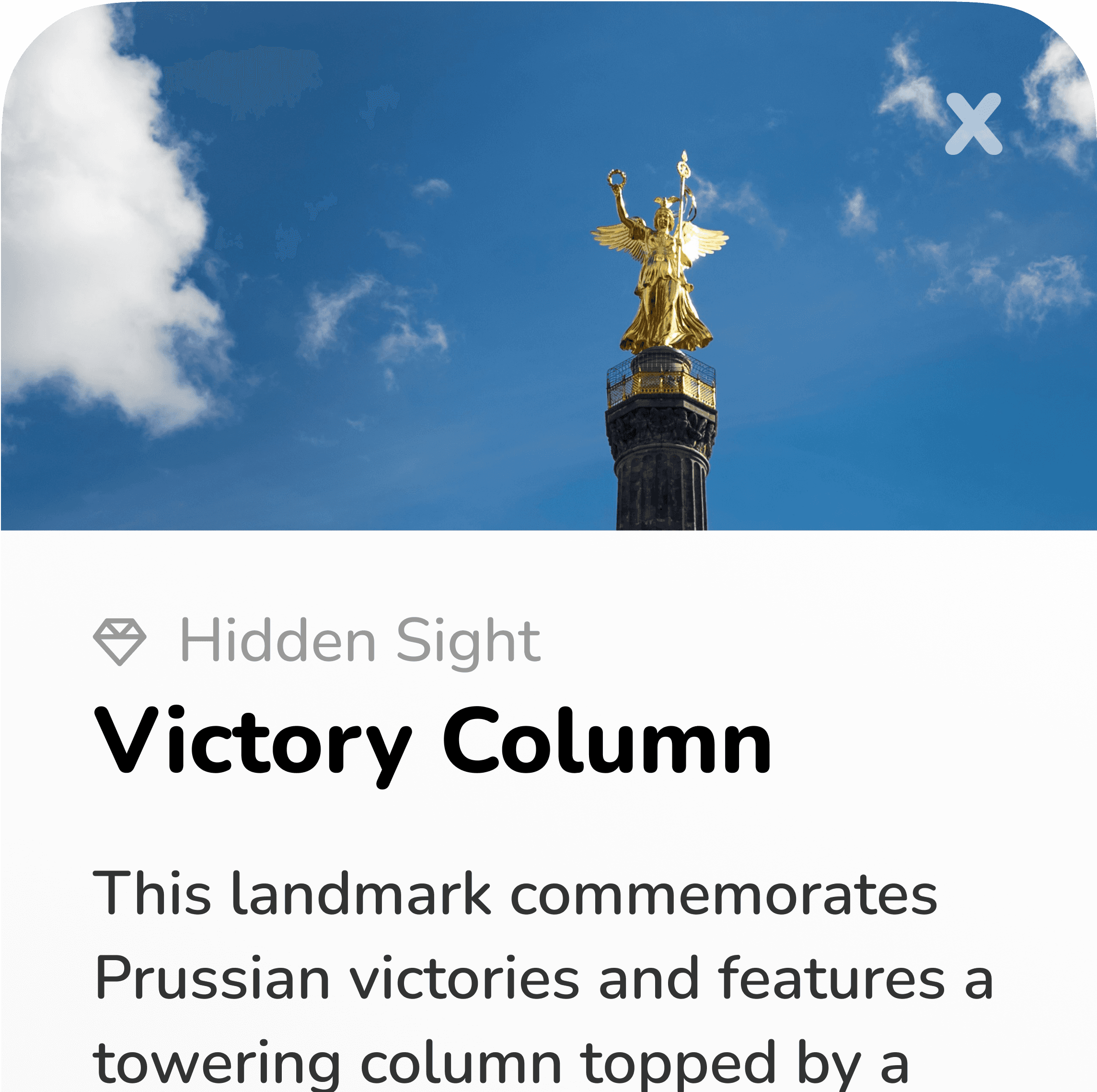
All over the city I kept noticing stuff that had no information on Google Maps, but piqued my interest nonetheless. Things that catch your eye when you're actually paying attention. "What's this statue about?" "That's a weird looking building." Impressions and questions that only arise when you look up from your phone.
How might we…
give users information about interesting things along their way?
Also: if people miss these things because they're looking at their screen, then maybe the app shouldn't be something you stare at? Maybe the most valuable thing it could do is give you a reason to put your phone away and actually look around, and then reward you for doing exactly that.
How might we…
encourage real-world attention instead of screen time?
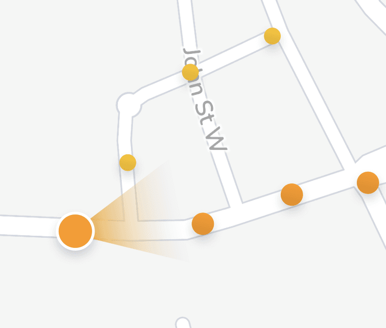
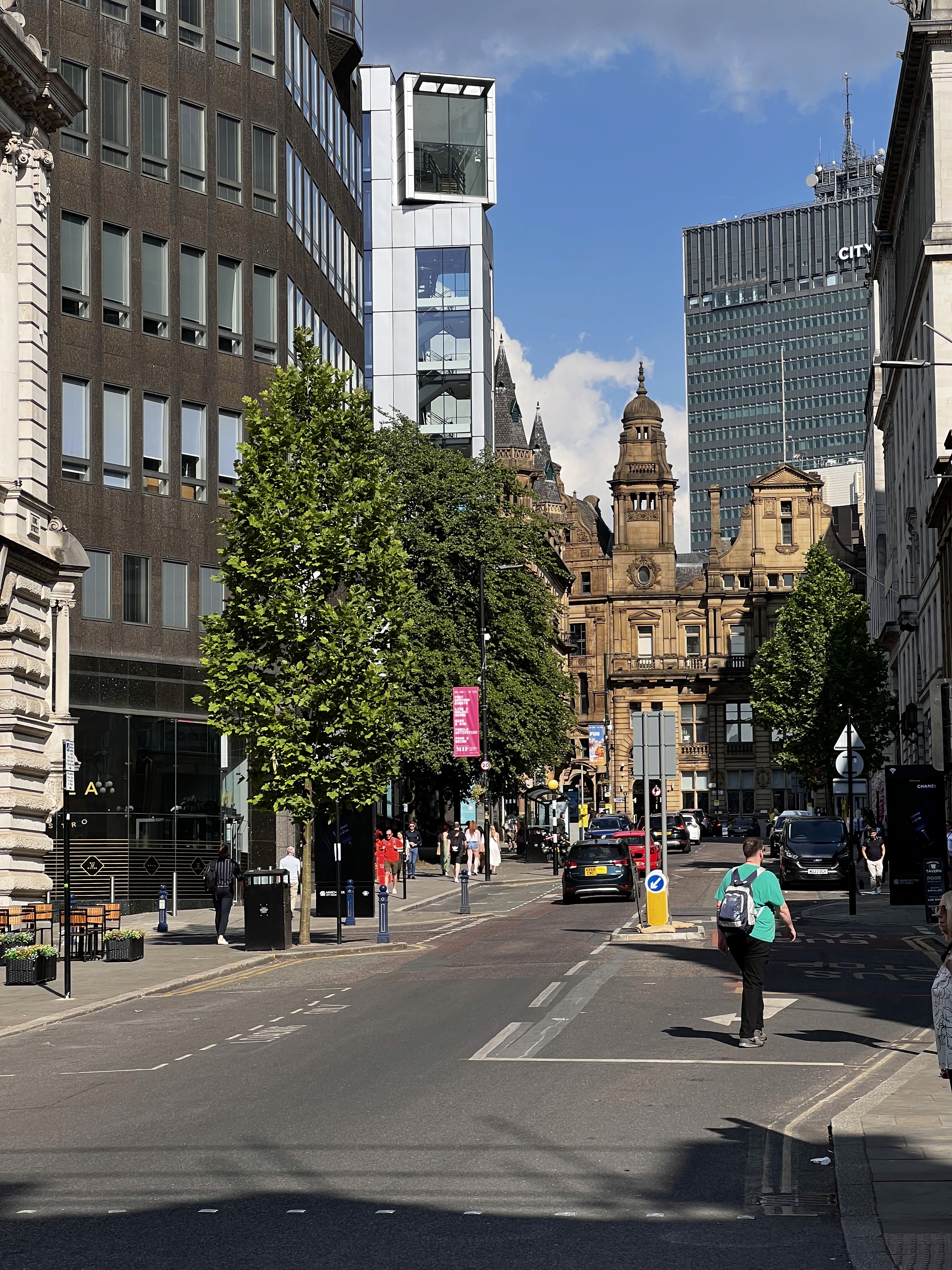
Manchester was the final stop on my trip. I'd been walking all day across Hamburg and Brussels at this point, so I had a decent feel for the kinds of problems that kept coming up. This time I was paying more attention to how I moved through a city over the course of a full day. After a few hours of wandering I realised I was starting to lose track of what areas I'd already seen. It reminded me of the 'Fog of War' in strategy games, where the map is hidden until you physically explore it. That's basically what I wanted: an overview of where I've been, so I can decide to take different turns and find streets I haven't walked yet.
How might we…
help users keep track of where they've been and what they haven't explored yet?
Once I started thinking along those lines, the gamification angle clicked. Rewarding people for exploring new streets could actually drive the kind of behaviour I was designing for. But then again, I'd inevitably walked some of the same streets twice, and it felt like dead time. At least I was getting my steps in, but it would be nice if that counted for something too.
How might we…
make every trip outside feel worthwhile, even when you're retracing your steps?
Some of the following features answer the questions I came back with from the trip pretty directly. Others took shape from a different angle, like how a feature would actually keep people opening the app a week in, or how the game would even reach enough players for more social-based mechanics to feel alive. A fair amount also just came from popular games, where design choices behind why something works are usually pretty visible if you pay attention.
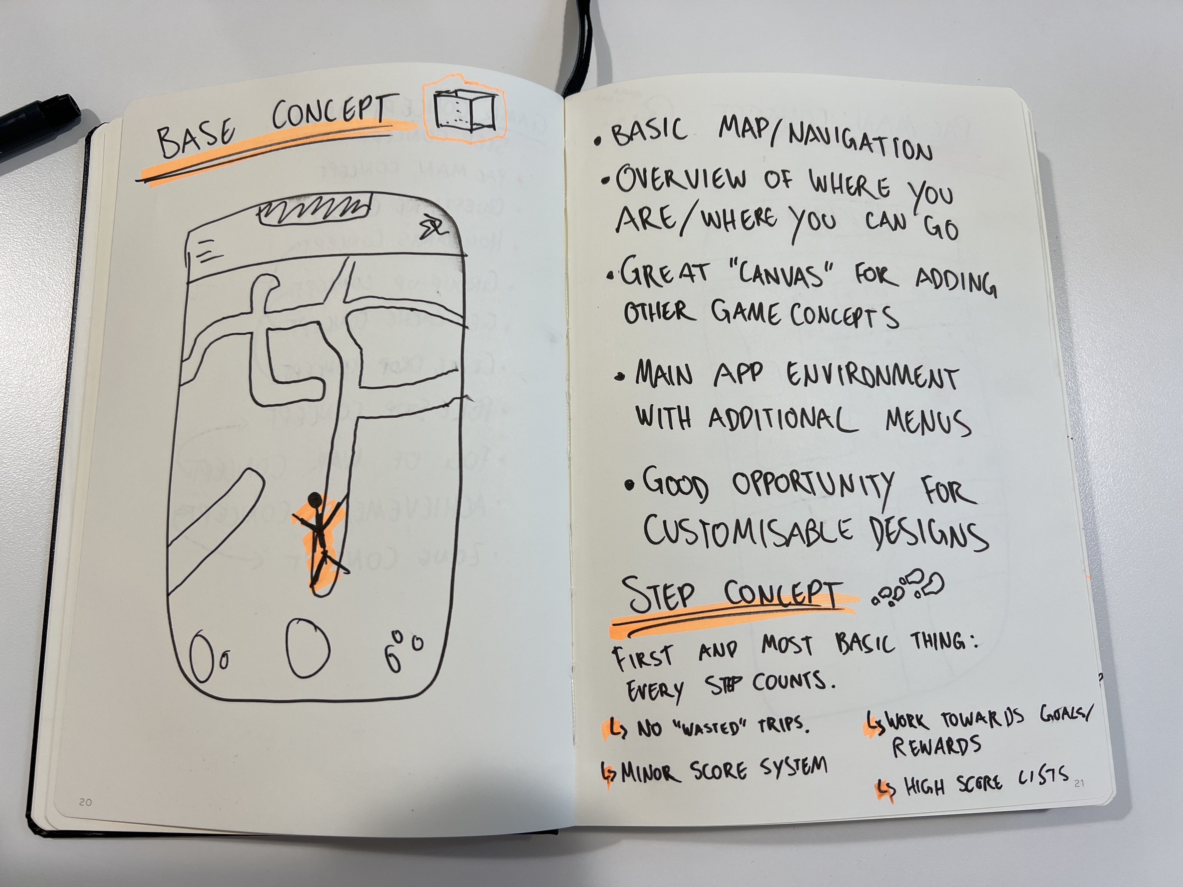
Gamification System
All these features come together through a layer of game mechanics that motivate engagement and keep players invested over time. This gamification system is what turns roaming through a city into a game with stakes, progression, and rewards worth chasing.
Quality Tiers
Items and rewards in the game come in different qualities, following a colour-coded rarity system that's pretty common in video games: Common, Uncommon, Rare, Epic, Legendary. The same tiers apply to chests and the items inside them, so the colours become a quick visual shorthand throughout the app for how valuable something is.
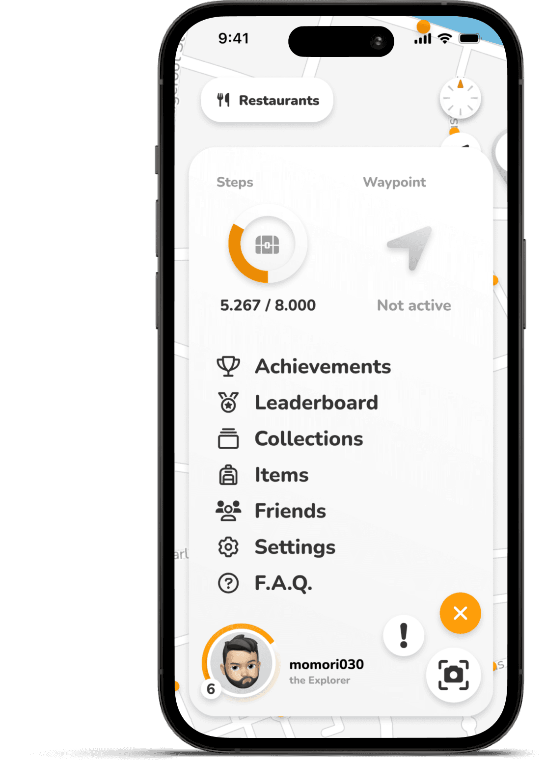
Experience Points (or short: XP) are the universal currency of the game and get rewarded for almost every meaningful action: collecting Discovery Dots, completing Storylines, getting Achievements, claiming Crate Drops, filling the Step Counter, and uncovering Location Markers. Earning enough XP gets you to the next level, with each level requiring more than the last.
Higher levels unlock visibility on the leaderboard, where players can compare their progress against friends and others nearby.
6
plus
100 XP

Uncommon Chest
treasure-chest
Common Item
80%
Uncommon Item
19.999%
Legendary
Item
0.001%
Rare Chest
treasure-chest
Common Item
20%
Uncommon Item
60%
Rare Item
20%
Epic Chest
treasure-chest
Uncommon Item
20%
Rare Item
60%
Epic Item
20%
Legendary Chest
treasure-chest
Rare Item
20%
Epic Item
75%
Legendary
Item
5%
Chests are how the majority of items makes it into your inventory. They come in four tiers: Uncommon, Rare, Epic, and Legendary.
The most common way to earn one is simply by walking. Every 8,000 steps you're able to claim an Uncommon Chest, which keeps casual play rewarding even on slow days. Higher-tier chests come from harder things: completing a Storyline might give you a Rare chest, finishing a tougher Achievement could give an Epic, and Legendary chests are deliberately hard to come by, mostly tied to Crate Drops and significant Achievements.
The drop rates inside each chest follow the same logic, so a Legendary chest still mostly contains Rare items with a small chance at Legendary ones. Rare stays rare.
Inside the chests you'll find items, which fall into four broad categories:
Functional items affect gameplay directly, like Weather Boosts that give you bonus XP for walking in bad conditions, or Legendary customisations that grant a permanent XP multiplier.
In-game cosmetics let players customise how they appear to others, things like avatar styles, borders, and player card designs.
App cosmetics are about personalising your own experience: alternative app icons, map styles, themes, mostly fun rather than functional.
And then there are Titles, which sit at the top of the system as the rarest reward, mostly earned through difficult achievements rather than chests.
Items also scale across tiers. A common Weather Boost might give a small bonus for half an hour, while a legendary version of the same item could be permanent. The same item type can show up at different rarities, doing more or less depending on the tier it dropped at.
Common Item
Epic Item
Legendary Item
Achievement
Rewards:
Achievement
Your Progress
6.013 / 10.000
Rewards:
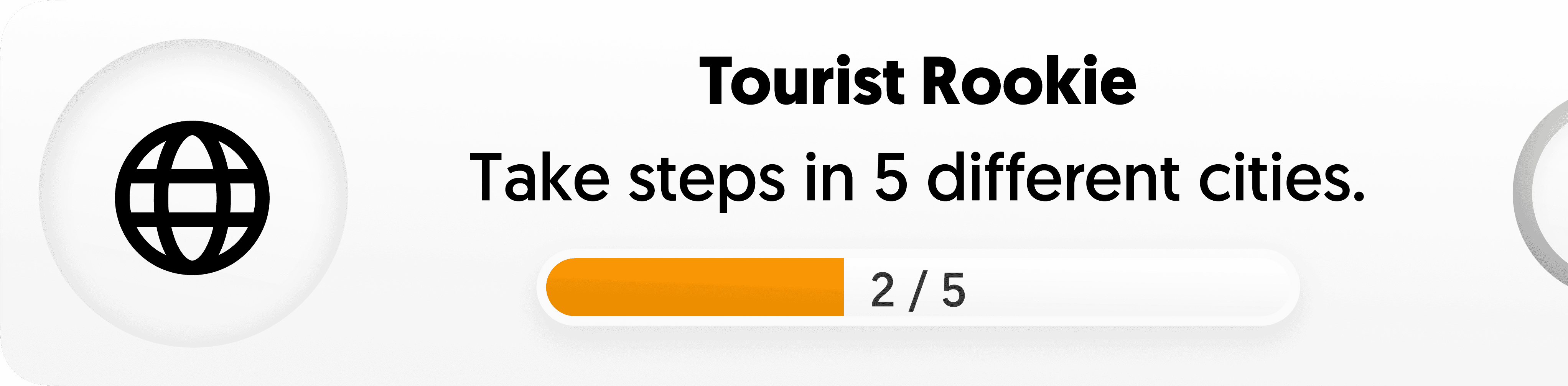
Achievements are the long-term goal layer.
They range from easy first-time milestones (your first 1,000 steps, your first Crate Drop) to multi-year challenges that take serious dedication to complete. Easier ones reward XP and lower-tier chests, while the hardest ones can unlock exclusive titles and Legendary rewards.
Achievements give players reasons to keep coming back over months and years, not just over single sessions. And they give players something to show for the effort: a Legendary title earned through years of walking is the kind of thing other players can see and recognise, and that visibility turns the long grind into something worth grinding for.
Layered on top of each other, these mechanics create three kinds of engagement loops at three different paces.
Each of these loops has its own pace and reward type, with basically one shared goal: keeping each city worth exploring.
Design Decisions
Three main principles shaped the visual direction of Pulse early on. Statements that capture the vibe I was going for and which I kept in mind when making design decisions.
The interface needs to be intuitive for a range of different target groups and stays out of the way most of the time, so the visual language is stripped down to the basics: neutral backgrounds, dark text, plenty of whitespace, and mostly just one accent colour carrying everything else. But at the same time it's important to keep it engaging and show personality through small details, like the slightly chunky typography, rounded corners on almost every surface, and subtle micro-animations.
The game side of Pulse gives room to be expressive, but the people using it are mostly adults exploring real cities, so the playfulness does need some extent of boundaries. The typography has an approachable character without being cartoonish, animations move with simple easing curves rather than springy bounces, and the icons read as friendly without trying to be too cute. This keeps the general language fun without drifting too much into being perceived as goofy.
The first two principles assume a fairly typical user, but this concept breaks the assumption of one big thing most apps take for granted. Most app designs imagine someone sitting still and paying attention. Pulse has to adapt to multiple other situations: one-handed use, walking pace, bright outdoor light, and quick glances at the screen. So it's important to design with these factors in mind and pay attention to touch target sizes, high color contrasts, placements of important actions, and to have information appear in small chunks you can take in quickly.
Colors
With these principles in mind, I put together the color palette, built around a single accent color. Orange does almost all the visible work, marking active states, important actions, and anything that needs to draw attention. Everything else stays neutral, with the greyscale handling text, borders, and surfaces.
Orange
#CA7A02
#FDA623
—>
#F8C52D
NEUTRALS
#2B2A28
#6B6862
#9B978F
#EEEEEE
#F8F8F8
RARITY CODES
#B8B4AC
#5FA855
#4A90D9
#9B6DD6
#FDA623
-->
#F5C518
To accommodate all use-cases, Orange comes in a few variations. The bright primary is used for fills and larger elements, while a darker version handles text and smaller details where the bright orange wouldn't have enough contrast on a light background. Additionally, a subtle gradient shows up on a few hero moments, like progress bars and reward banners.
The rarity colours follow the usual video game convention, going from a neutral grey for Common up through green, blue, and purple. Legendary was a bit trickier. Following the established convention, Legendary usually uses orange, but I noticed that it made these rare items feel less special, given the app environment. Reaching for a different colour entirely would have clashed with the implied expectation. So I landed on a warm golden gradient that fits the brand, but earns its status through a subtle shimmer effect that nothing else in the app gets.
Typography
For the typeface I decided to go with Nunito, a sans-serif with slightly rounded letterforms. It's friendly without overdoing it, which makes it a good fit for the playful-but-not-childish principle, and the rounded curves echo the rounded corners used throughout the interface. It's also genuinely easy to read at small sizes and on the move, with type sizes stepping up in clear intervals to keep the hierarchy scannable.
Display
Heading
Body text – used for paragraphs and longer reading content.
Caption
The Icons come from FontAwesome, which pairs well with Nunito because both share that slightly chunky, approachable character. Using a single icon library keeps everything visually consistent without me having to design custom icons for every feature.
compass
binoculars
trophy
museum
sparkles
compass
binoculars
trophy
museum
sparkles
UI Pattern
The whole interface is designed using subtle neumorphism, a design language that make elements feel more tangible, communicated through a conscious use of shadows, slight gradients, and rounded forms.
It fits the principles in multiple ways: the surfaces stay clean and uncluttered (simple but not boring), while the soft shadows and tactile feel add personality without getting loud (playful but not childish). Slightly raised buttons and pressable surfaces also make interactive elements obvious at a glance, which helps when the app is being used on the move (designed for walking).
A closer look
Move through Pulse screen by screen, and tap the glowing points to see how each part of the app turns a city into something worth getting lost in.

Coming soon
More details added every week.